
The debesto delivery price list page serves to prove price transparency to potential customers. They can quickly find out how much they will have to pay for the transportation of their order and under what conditions it will be delivered. The site contains all the price lists for the countries to which customers need to deliver their window orders.
The idea for creating a separate US-only price list page was the need to better explain the process and delivery costs to customers from the States.
This project was part of my work for the debesto company.
My role in this project was very significant - I did all the research and design work, conducted a survey and when it was ready I implemented parts of it myself, in the website editor and contacted the developers for implementation and testing. Before that, I would get approvals from my supervisor, to whom I would communicate my design decisions. Texts on the site were created with the cooperation of a logistics specialist and a copywriter.
Role: UX/UI research & design (commercial project)
Duration: March 2023 - June 2023
Tools: Figma, Google Forms, Hotjar
THE PROBLEM: US customers afraid to order windows from overseas.
THE GOAL: Designing a responsive website so that U.S. customers have a greater sense of security regarding delivery, which will result in increased order conversions.
Where do I start?
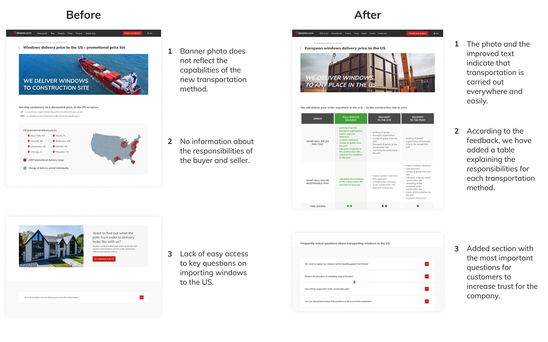
Currently, all information about window delivery to the US is found along with price lists for other countries, without valuable information. There are no visible divisions of the page as sections for each country. Under the header of the page, the information on delivery to the U.S. There is a circular graphic of a flag next to a table with prices by 20- and 40-foot containers, as well as cursory information on shipping rules and method. At the end of the page, under all the tables, there are the company's transportation regulations.

Previous delivery price list page
- 01 RESEARCH -
How to make it better?
How to make it better?
I conducted interviews, created personas and user journey maps to understand the users I’m designing for and their needs. Information on the delivery of windows to the States on the site seek people interested in buying them from Europe. They are both construction companies, but also private customers, mostly without previous experience in importing windows by sea transport.
The next step, after the empathy phase, was to find out what exactly users needs to find on the site in order to contact them about placing an order. The website had to be designed in such a way that all information relevant to users could be easily found, as well as to build a sense of transportation security and trust in the company.
Through research, I was able to list the necessary information on the site:
- methods and delivery locations available for selection,
- delivery prices,
- detailed description and responsibilities of each party, listed for available transportation methods,
- photo gallery of packed windows for transport, with information on how they are packed,
- clear and updated transportation regulations for shipments to the States
- a link to a blog article explaining all matters related to importing windows to the US,
- a link to described examples to completed orders to the States,
- as well as a link to the contact form.
- 02 DESIGN -
What will such a page look like?
What will such a page look like?
After writing down all the things that need to be on the site, I decided what priority each of them has, that is, in what order they should appear on the site.
In the beginning, we needed a clear graphic statement that we were concerned with real transportation. A banner with a picture of a ferry carrying packed containers - the most important part of transporting windows to the States - came in handy here. Right off the bat, we outline the transportation methods the customer can choose. On top of that, a graphic representation of this on a map is very useful and easy to understand - the user can immediately see where he can count on which method of transportation.
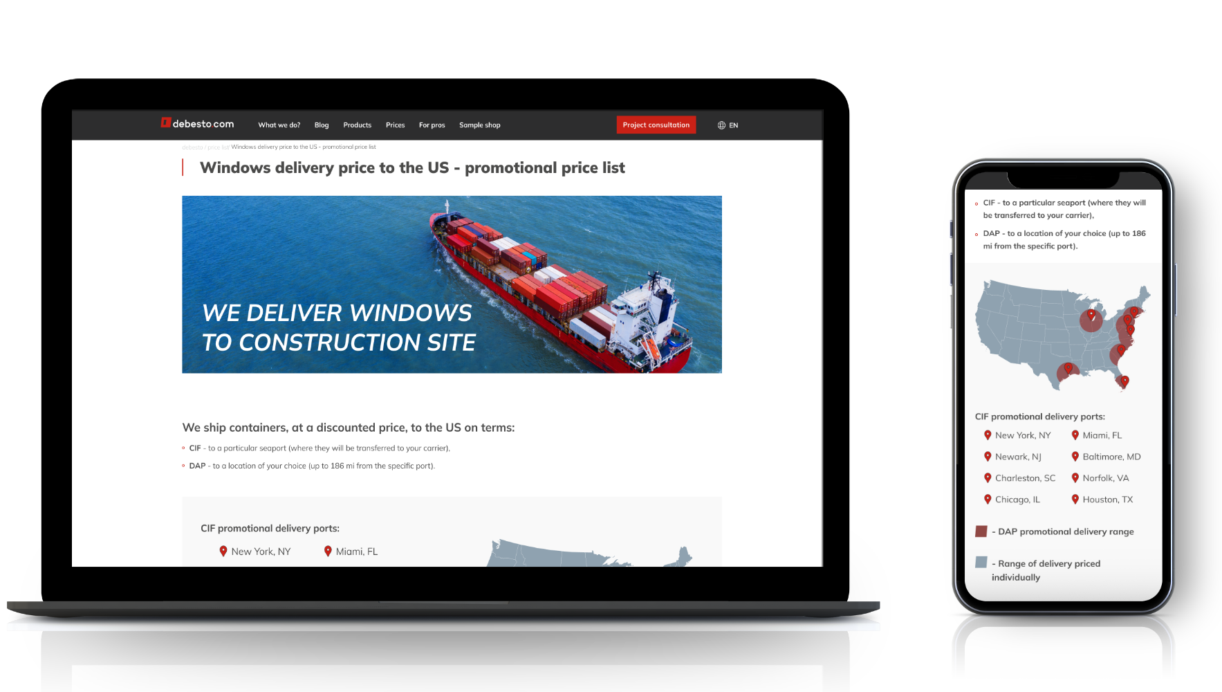
Banner and map
When the user has already got a preliminary understanding of the delivery options, he can then estimate the price. He sees two tables broken down by container size and order price and the savings the company offers him - the more windows he buys, the cheaper the shipping will be.
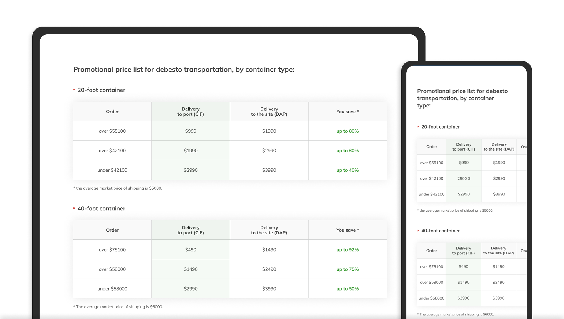
Price list tables
After these sections, a prominent break appears on the page, where the user has the opportunity to breathe and contact the company. A more interested user scrolls lower where he has the shipping methods explained, along with graphic illustrations suggesting where the window shipping ends up - at the port or on site. On top of that, we give him the opportunity to go to a page with an article explaining how the entire window import process works.
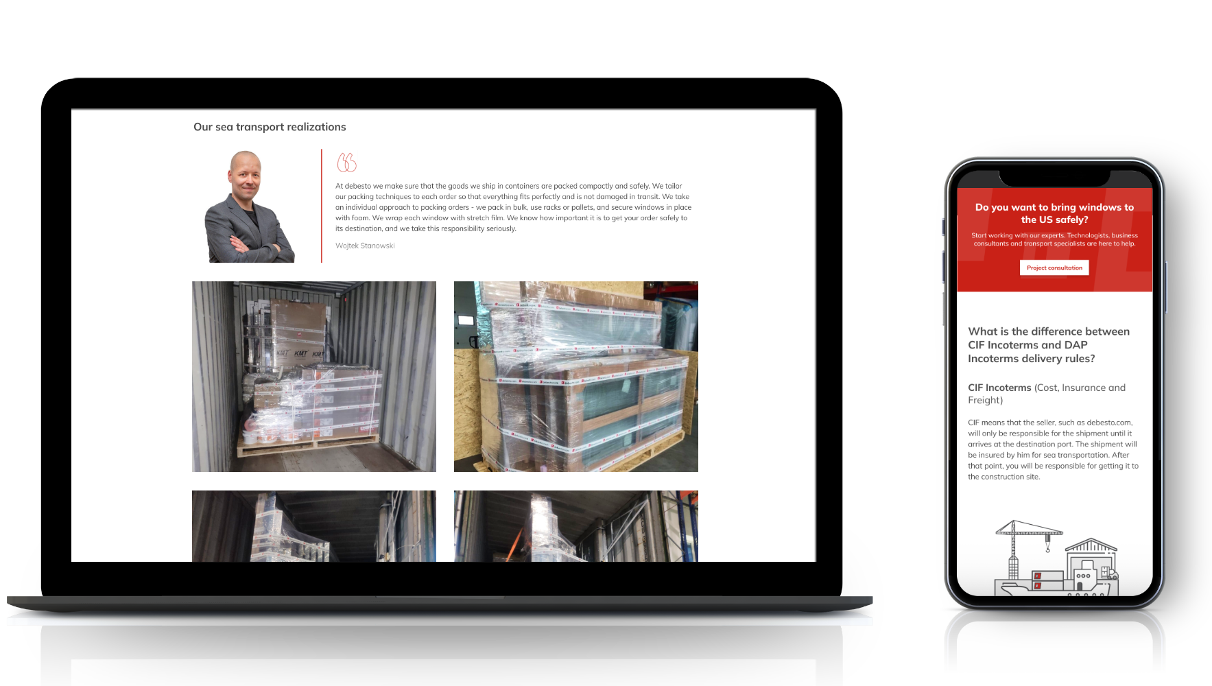
Gallery and shipping methods section
- 03 TESTING -
Could that be all?
Could that be all?
Once we had an initial design of the site that matched our assumptions, we asked colleagues to test the site and check that everything was designed well for people looking for delivery. Thanks to the feedback, I was able to make some small improvements to the text and make some elements more visible.
- 04 MODIFICATIONS -
Why it wasn't enough?
Why it wasn't enough?
After the separate US delivery price list page was ready and implemented on the website, we noticed that we could implement another improvement for customers.
How to improve it?
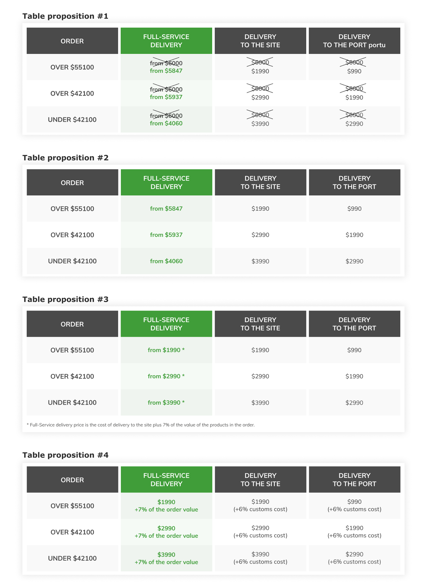
After salespeople spoke with customers interested in ordering windows, and who saw the new price list page, we realized that the available transportation methods were not sufficient. Fortunately, for some time our logistics specialist had been interested in the topic of a new method where the customer doesn't have to worry or control practically anything, and where the company handles most of the paperwork and fees. For this, we needed to post new information on the site. The problem was the prices in the table - how to make it easy to understand, while encouraging the choice of the most convenient method of transportation. The second concern was the complexity of the existing prices, since the delivery price of the method changes depending on the amount of the order. On top of that, the new method calculates a percentage depending on the value of the products in the order.
Such a hard task I wanted to do as well as possible, so I suggested the 4 solutions for the table design and created a survey for our employees who talk to our customers on a daily basis, and they are the ones who explain the price list to help them make the final decision. The table had to be understood by our salespeople, technologists and logisticians in order to be understood by our customers. In addition to the proper international name for this method, we wanted to give it a more understandable tone, so they were asked to comment on it.
SEEKING A SOLUTION: We need the customer to know immediately when looking at the table know how much he will have to pay in each delivery option - to promote a new delivery in which practically everything the company does for him (but that makes it look like it is the most expensive).
SEEKING A SOLUTION: We need the customer to know immediately when looking at the table know how much he will have to pay in each delivery option - to promote a new delivery in which practically everything the company does for him (but that makes it look like it is the most expensive).

Google Forms table survey
What were the results of the survey?
Feedback has been very helpful. For each iteration I was able to assign an average rating, I got information on what was good and what needed to be improved. This made it easy to identify a winning version and improve it further.
Proposed design of price list tables.
Table proposition #1: The lowest score was given to a solution in which the average price of transportation to the US is crossed out, and underneath it are promotional prices for each method by order amount. The only thing that distinguishes the new method is the green color of the column, but the prices for it are apparently more expensive. Everyone collectively commented on the cross-outs as unreadable, that they disrupt the view.
Table proposition #2: A slightly better rating was given to another version, in which all prices are immediately calculated, but show the “from” price. This was not a very good solution, because the method we want to promote, and is the cheapest for customers, looks like the most expensive in the table.
Table proposition #3: In the third version, the prices for the new method are still presented “from”, but they are the base price, with a note under the asterisk that 7% of the order must be added to this price. Despite the fact that the table was evaluated as clear and encouraging, the addition was not perceived as user-friendly.
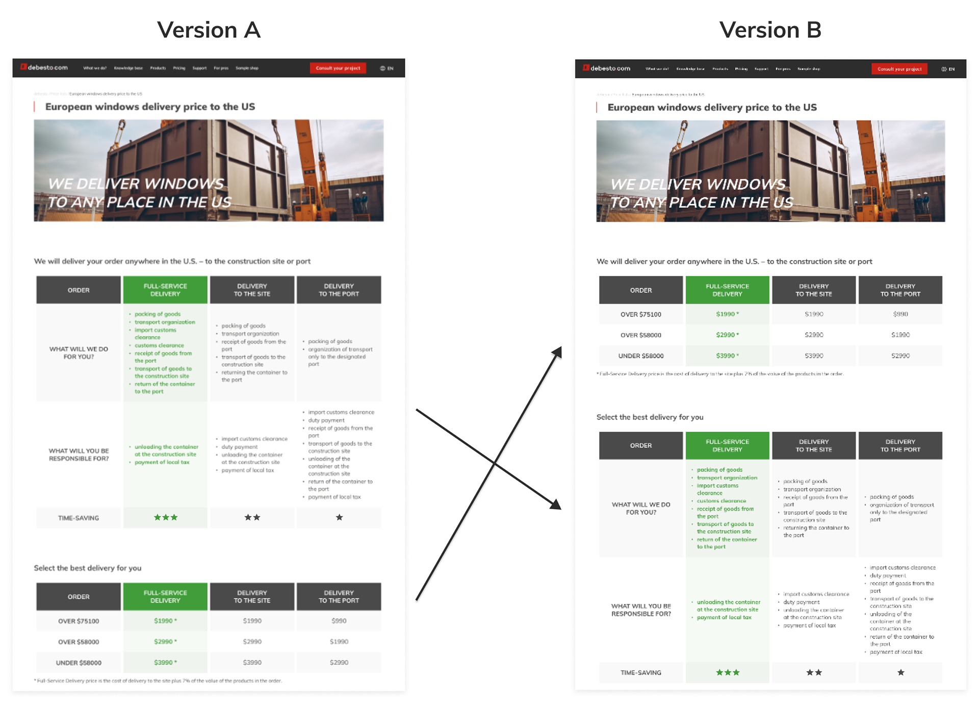
Table proposition #4: The best rated version - each price has information about the additional charge, so the customer knows in advance what costs await him. Respondents indicated that this was the most favorable version in terms of price design, amount of information and transparency. After implementing the suggested improvements to it, we got an even better version. A success!
Table proposition #2: A slightly better rating was given to another version, in which all prices are immediately calculated, but show the “from” price. This was not a very good solution, because the method we want to promote, and is the cheapest for customers, looks like the most expensive in the table.
Table proposition #3: In the third version, the prices for the new method are still presented “from”, but they are the base price, with a note under the asterisk that 7% of the order must be added to this price. Despite the fact that the table was evaluated as clear and encouraging, the addition was not perceived as user-friendly.
Table proposition #4: The best rated version - each price has information about the additional charge, so the customer knows in advance what costs await him. Respondents indicated that this was the most favorable version in terms of price design, amount of information and transparency. After implementing the suggested improvements to it, we got an even better version. A success!
What else have I improved?
The banner photo did not reflect what we wanted to present when we added the new delivery. We wanted it to show the moment the container with the order was unloaded at the customer's construction site.
In addition, I wanted users to immediately see the difference between the three available delivery methods. In cooperation with the company's logistics specialist, I created a second table, in which the responsibilities of the customer and what the company will do for him were listed. By the sheer number of things listed, you can see at a glance which method is the most time-saving.
The last thing was to add an FAQ at the end of the page with all the questions about window delivery to the US. From observing users' traffic on the site, I knew that these were interesting questions for them, to which they often sought answers.
- 05 A/B TEST -
Have I tested it?
Have I tested it?
Of course, during the implementation of the project, a thought was born in my head that I did not know the answer to. I wondered in which order to set the tables - the one with prices and the one with responsibilities. If the first table is informative, then users will be more aware of which delivery method they are interested in. In this situation, I was worried that if they didn't see the prices first, when going to the price list page, this might not work, and they would leave immediately thinking that they opened the wrong page, because it doesn't meet their needs.
That's why after implementing the price list page revisions, I did one thing right and ran an A/B test using the VWO platform to see which version would convert better.
The results were clear - users who saw the page with the pricing table above were more likely to contact the company about placing an order. On top of that, the session recordings confirmed the veracity of the data and my concerns about abandonment of a page with no immediately visible prices.
- 06 TAKEAWAYS -
What benefits did the new site bring?
What benefits did the new site bring?
After implementing all the corrections and adjusting the site for users who are interested in ordering windows from overseas, we noticed an increase in the number of visits to the contact page (by about 20%), and thus increasing the number of contact forms sent for order placement by 15%. Ultimately, the changes made led to a steady increase in sales conversions.
What did I learn?
I've learned that it's important to constantly pursue the topic of improving the user experience, not to stop at one good version, because something even better can emerge from it. That it's worth testing different versions of how a thing looks, because it's extremely important that even the smallest thing is properly presented and in the right place.Next steps:
- Continuous monitoring of site performance.
- Watching recordings of users navigating the site and improving the user experience.
- Work with logistics on further simplification of prices - maybe it is possible to limit the price of delivery depending on the delivery method, but no longer divided by the value of the order?