joindebesto is a site for people who want to work in the debesto company. The site can be visited through a web browser on a computer or mobile. There, candidates can find out what the company does, see what the office looks like, browse through job offers, see what the benefits are and learn about the recruitment process. The company only employs people from the country in which it is based, so the whole website is in Polish.
The idea for this website was to create a separate service from the company's website targeting the best employees and showcasing the company to encourage them to apply.
The reason we did this project was because the existing recruitment site was very poor, and thus the company could not grow due to lack of new talent.
I created this site design as part of my work for the debesto company.
My position in this project was very significant - I did all the research and design work and then contacted the developers about implementing the project and testing the performance of the website they had written. I worked in a team of two with a colleague on internship who was a Product Manager for the first time. She validated all the results of my work and at every stage I explained to her the reasons for my design decisions.
Role: UX/UI research & design (commercial project)
Duration: July 2022 - September 2022
My responsibilities:
- paper and digital wireframing,
- low and high-fidelity design,
- research of needs,
- animation prototypes,
- iterating on designs,
- cooperation with developers.
- paper and digital wireframing,
- low and high-fidelity design,
- research of needs,
- animation prototypes,
- iterating on designs,
- cooperation with developers.
Tools: Figma, Affinity Designer, Clickup
THE PROBLEM: The company does not seem attractive to candidates to apply for job offers.
THE GOAL: Design an informative application site that can be easily accessed by phone and computer.
CURRENT DESIGN
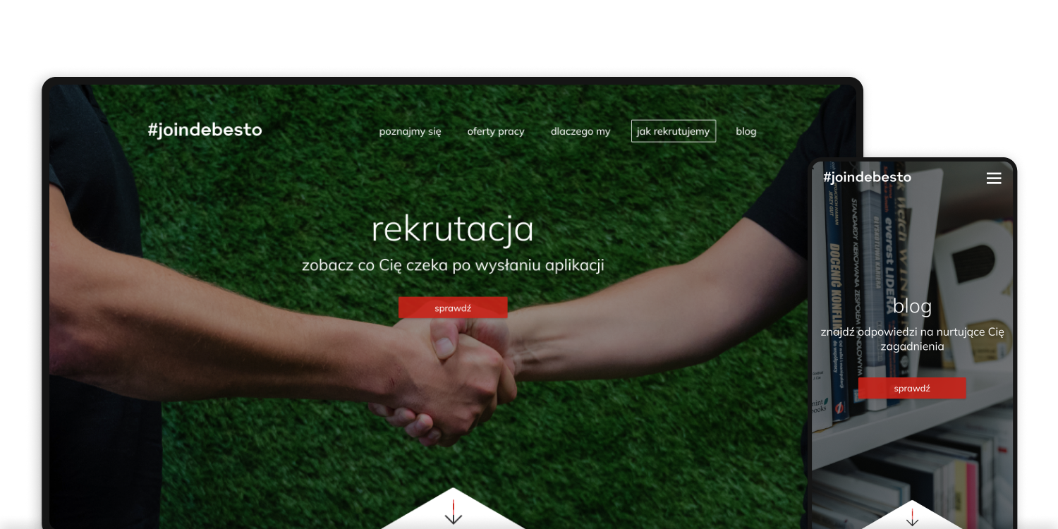
The current website, as the supervisor described it, is uninteresting and unattractive, resulting in a very low number of applicants. First we see a hero image with a CTA leading straight to the job offers. Below that we have a short text introducing the company and its mission. This is followed by a description of the job benefits and promoted offers at the end of the page. The page can be described as an MVP, through which the company has collected some data that I can use in my project to improve this experience.
STEP 1 - RESEARCH OF NEEDS
RESEARCH
I conducted interviews, created personas and user journey maps to understand the users I’m designing for and their needs. A primary user group identified through research was young people looking for the best place for them to start their first major job.
This user group confirmed initial assumptions about candidates, but research also revealed that some are looking for their next job and already have a lot of experience in their field.
PERSONAS

PRIMARY
Name: Hana
Age: 25
Education: University
Hometown: Oleśnica, Poland
Household: Husband
"I hope to find my dream job soon."
Hana is just about to graduate from college, so she has started looking for her first full-time job. She previously worked casually in cafés, but now she wants to find something serious where she can pursue her career and earn more money in the process. They live with her husband in a small flat, so if they want to expand the family, then Hana needs to find a stable job with good benefits for the long term. She browses the Internet every day in search of a dream job.
Goals:
- finding a dream job
- finding a dream job
Frustrations:
- not having all the relevant information about both the job and the employer in one place
- not having all the relevant information about both the job and the employer in one place

SECONDARY
Name: Cornelius
Age: 52
Education: Technical school
Hometown: Wroclaw, Poland
Household: Wife and two kids
"I need a job where I can realize myself and pass on my knowledge"
Cornel feels he needs a change and a new place to work. He wants a management position where he can demonstrate his skills and make important decisions that shape the company's development. From time to time, he browses job listings in search of a suitable position. He needs a place where he can see that his experience and talents will be valued.
Goals:
- changing jobs
- changing jobs
Frustrations:
- doesn't have time to spend hours every day looking for a job
- doesn't have time to spend hours every day looking for a job
USER NEEDS
The next step, after the empathy phase, was to find out what the users are looking for and needs on the site in order to apply. The website had to be designed so that all the information that matters to users can be found easily and, in the process, they will also get to know the company's profile.
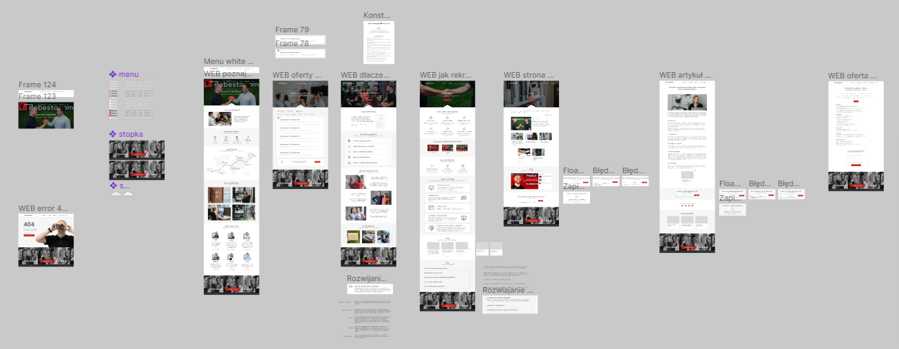
Thanks to the research, I was able to list individual things and assign them to specific categories, so I specified four sub-pages to design:
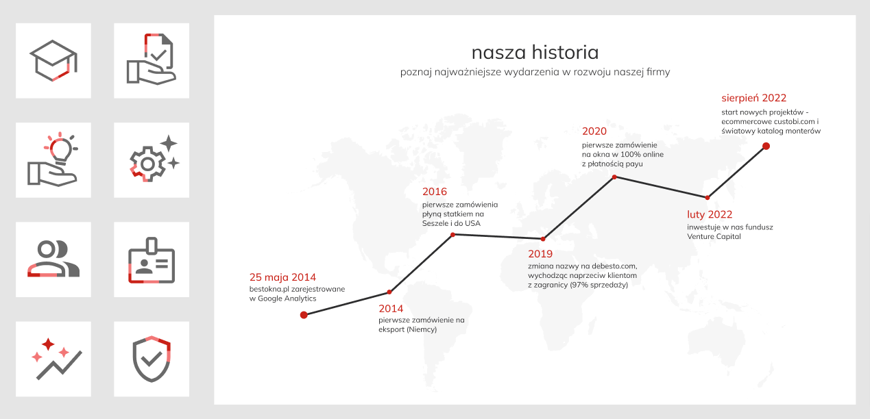
- "meet us" which includes all the information related to the company, such as a brief description of what it does, it's history with highlights, photos of the office and the managers of all departments,
- "job offers" broken down into full-time and internship positions, as well as individual departments within the company,
- "why us" presenting the company's most important values, the main benefits of working for the company and the current opinions of employees,
- "how we recruit" which is all the relevant information about the stages of recruitment and an explanation of the type of candidates the company is looking for, as well as a section with the most frequently asked questions so far during a recruitment process.

Sorting content to individual pages
Executives have determined that they want to target successful companies, so the application site will be a major project and will be a separate website from the main company site. Therefore, in addition to the above pages, I had to design a navigation bar, footer, blog page and article page template, as well as a 404 error page.
STEP 2 - WEBSITE FOR DESKTOP
The second step, was to determine which version to start designing the site with. In this case, the company has statistics on users visiting an existing career site. A slightly higher number of users access via desktop, so I started designing for a bigger screen.
HIGH-FIDELITY PROTOTYPE
My PM gave some initial thought to what she would like the site to look like, so following the guidelines of her low-fidelity wireframes and user needs, I designed a high-fidelity prototype in Figma.
Career site hi-fi wireframes
TESTING
Once we had an initial design of the site that matched our assumptions, we asked colleagues to test the site and check that everything was designed well for people looking for work. Thanks to the feedback, I was able to make some small improvements to the text and make some elements more visible.
STEP 3 - WEBSITE FOR MOBILE
Once the design of the site for desktop was complete, it was time to design a mobile version for it.
HIGH-FIDELITY PROTOTYPE
Once the website design was tested, I was able to start designing the mobile version. This was fairly straightforward, as I followed the example of the desktop version and created the relevant sections, ensuring that this time they were specifically tailored for users viewing the site on their phone.

Career site lo-fi wireframes
ANIMATIONS AND INTERACTIONS
To make the page interesting and encourage people to stay on it, I designed lottie icons that animate when the user scrolls to the icon's location. I thought about what each interaction should look like and described them. I prototyped the animations of the larger sections, so the developers knew what they should look like.
Examples of content for which I designed animations
TAKEAWAYS
Impact
A few months after the site's launch, the company hired 20 new employees. Thanks to the new site, the company has been able to promote itself and gain new talent, in specific profiles, and is growing every day as a result.
After its launch, the site increased user traffic by almost two times, and encouraged users four times more to send job applications to the company.
Highlighted quotes from the chief executive:
Highlighted quotes from the chief executive:
“ I would immodestly say that this is the best recruitment website in the industry!”
What I learned
I learnt how much work and heart it really takes to put into a project in order to create a complete platform. How much fun it is to be able to navigate later in a hand-designed project that is fully interactive. It's amazing to know that people looking for a job can find the website I designed.
Next steps
- Continuous monitoring of site performance.
- Watching recordings of users navigating the site and improving the user experience.