SortWaste is a tool to help people better segregate their rubbish. With dedicated app or by accessing the website users can check which bin to put each waste into, learn how to recycle and how to safely dispose of their waste. Users can search for answers by typing the name of the waste in question with a standard keyboard, as well as by using speech or a barcode that appears on the package. Also, this tool helps users locate recycling centres on the map as well as their contact information.
The idea of this toll was directed at older people, but it will also help to teach young children who are facing this topic for the first time, as well as anyone who wants to check where to dispose of a particular waste on the go.
I created this app for my project for the Google UX Design course.
The reason I chose such a project is that when I throw away my rubbish, I see poorly segregated waste in the rubbish cans. My peers and I were taught by our teachers at school how to properly separate our rubbish. In fact, I even took a class on it in college. However, elderly people didn't have such an opportunity, because in the past they didn't have to segregate. They were suddenly thrown into this world and no one tried to teach them how to properly segregate. Clearly, informational posters are not a good source of learning for them. I wish our planet would get less fatigued by us segregating our waste better.
Role:
UX/UI research & design
(individual project)
(individual project)
Duration:
November 2021 - January 2022
My responsibilities:
Conducting interviews,
Paper and digital wireframing,
Low and high-fidelity prototyping,
Conducting usability studies,
Accounting for accessibility,
Iterating on designs
Paper and digital wireframing,
Low and high-fidelity prototyping,
Conducting usability studies,
Accounting for accessibility,
Iterating on designs
Tools:
Figma, Affinity Designer, Adobe Photoshop, pen and paper
THE PROBLEM
People segregate their waste incorrectly, throwing it in the wrong bins.
THE GOAL
Design an easy tool (dedicated mobile app and responsive website) to show people how to properly dispose of their waste.
RESEARCH
I conducted interviews, created storyboards, empathy maps, personas, user journey maps to understand the users I’m designing for and their needs. A primary user group identified through research was elderly people who have not been taught how to properly separate their waste.
This user group confirmed initial assumptions about seniors, but research also revealed that some people have memory problems and simply can't remember which bin to put their waste in.
PERSONAS
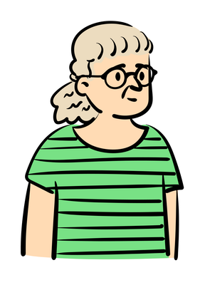
PRIMARY
Name: Siena
Age: 72
Education: Elementary school
Hometown: Warsaw, Poland
Household: -
Employment: Pensioner
"I just need a little help to sort my rubbish correctly."
Siena lives alone in her flat. She has memory problems, so among other things she can't remember how to separate waste, which is important to her. Nonetheless, she doesn't want to impose on her family and keep calling them with questions about it. Fortunately, Siena can use a cell phone to a basic extent, but browsing for information about waste segregation is too hard for her. She would be very happy to have a dedicated mobile app for this with easy access to answers.
Goals:
- checking waste sorting instantly
- dedicated mobile app with easy access to answers
- checking waste sorting instantly
- dedicated mobile app with easy access to answers
Frustrations:
- trouble remembering how to sort properly
- trouble remembering how to sort properly
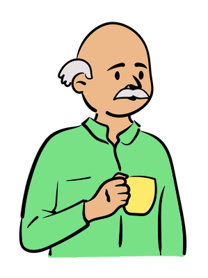
SECONDARY
Name: Horace
Age: 66
Education: Technical school
Hometown: Gdynia, Poland
Household: Wife
Employment: Retiree
"Good thing I wasn't left alone with this segregation!"
Horace is living with his wife in a small house in the countryside. They often get penalties for improper segregation because they throw their waste in the wrong containers. As a result, they lose a lot of money. They have a computer at home, and even a tablet is always lying within reach. Horace knows how to use a web browser, but he doesn't know an easy way to quickly find out which rubbish can to put the right thing in.
Goals:
- learning how to sort rubbish properly, together with his wife
- one website for checking waste sorting
- learning how to sort rubbish properly, together with his wife
- one website for checking waste sorting
Frustrations:
- penalties for improper waste segregation
- penalties for improper waste segregation
STEP 1 - MOBILE APP
The first step after the empathy phase, in the design section, was to determine which version to start designing the tool with. Will users be more likely to use it on a phone or a computer? In this case, it will be more convenient to check where to dispose of a given waste on a device that you have at your reach most of the time.
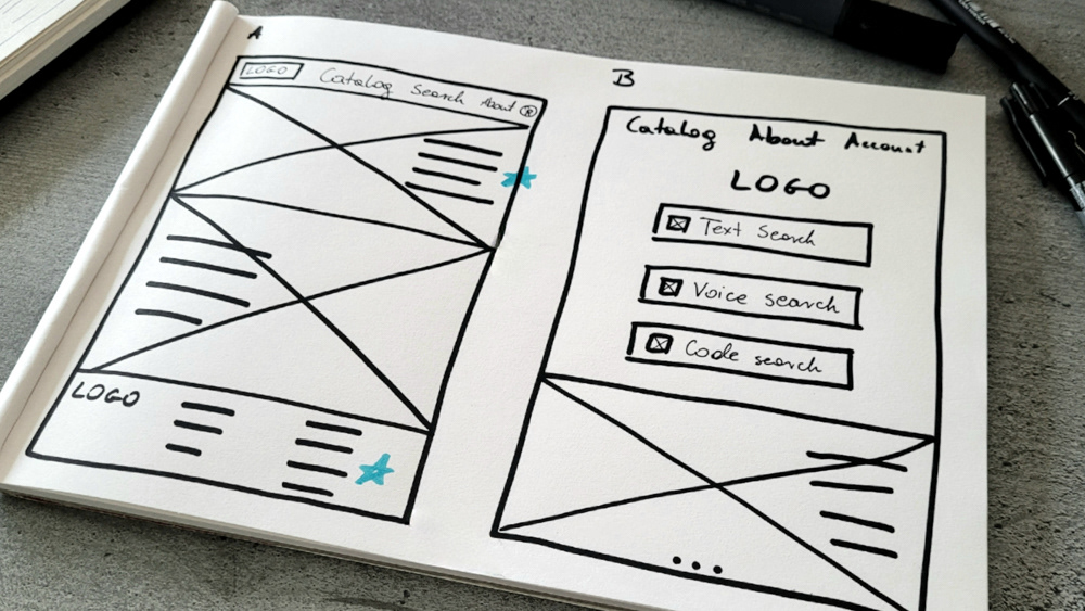
PAPER WIREFRAMES
Initially thinking about individual screens, I created paper wireframes for the main user path - inquiry about the correct segregation of the specific waste. These allowed me to immediately see if I had planned the path correctly and made it easier to create digital wireframes in Figma later.

SortWaste mobile app paper wireframes
LOW-FIDELITY PROTOTYPE
With functionality in mind and a focus on the end user, I created a simple wireframe of individual screens that I linked together with interactions. This gave me a low-fi prototype, so I could test whether the app fulfils its purpose and identify potential errors.
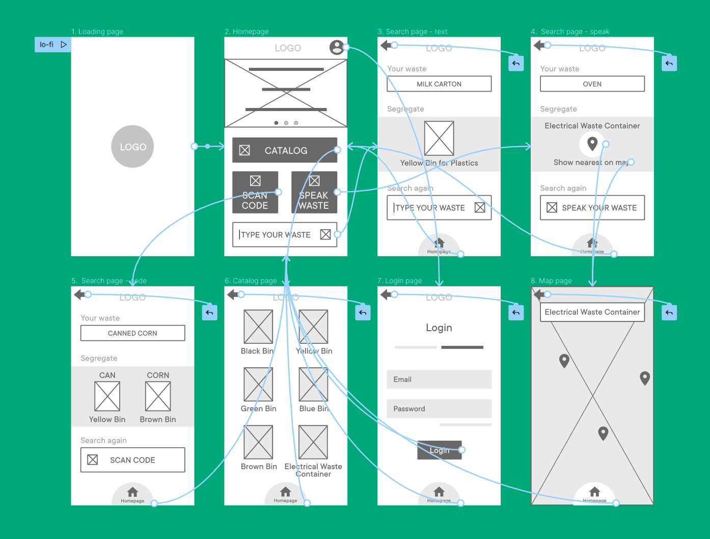
SortWaste mobile app lo-fi prototype flow
USABILITY STUDY
I conducted tests with few people by asking them to perform some simple tasks within the app. To my surprise, users have been using the app exactly as I designed it. I noticed that I had evolved significantly after the previous project. I was inserting correct affordances which made it easy for testers to pass main flow. Overall, testers concluded that the application is well-structured and everything can be easily found, but there were some areas where I could enhance the prototype to make it more useful
for users to use.
for users to use.
Findings:
1. Users need to have an even simpler and faster process for finding answers by text.
2. Users need to know that they are looking at a banner and have a more intuitive interaction with it.
3. Users need to have clearer individual sections on the answer page.
1. Users need to have an even simpler and faster process for finding answers by text.
2. Users need to know that they are looking at a banner and have a more intuitive interaction with it.
3. Users need to have clearer individual sections on the answer page.
HIGH-FIDELITY PROTOTYPE
The final high-fidelity prototype presented cleaner user flows for inquiry about the correct segregation of the specific waste. I had to add more pages than I assumed for the low fidelity prototype, so that it would also meet user needs for fewer clicks to search for answers.
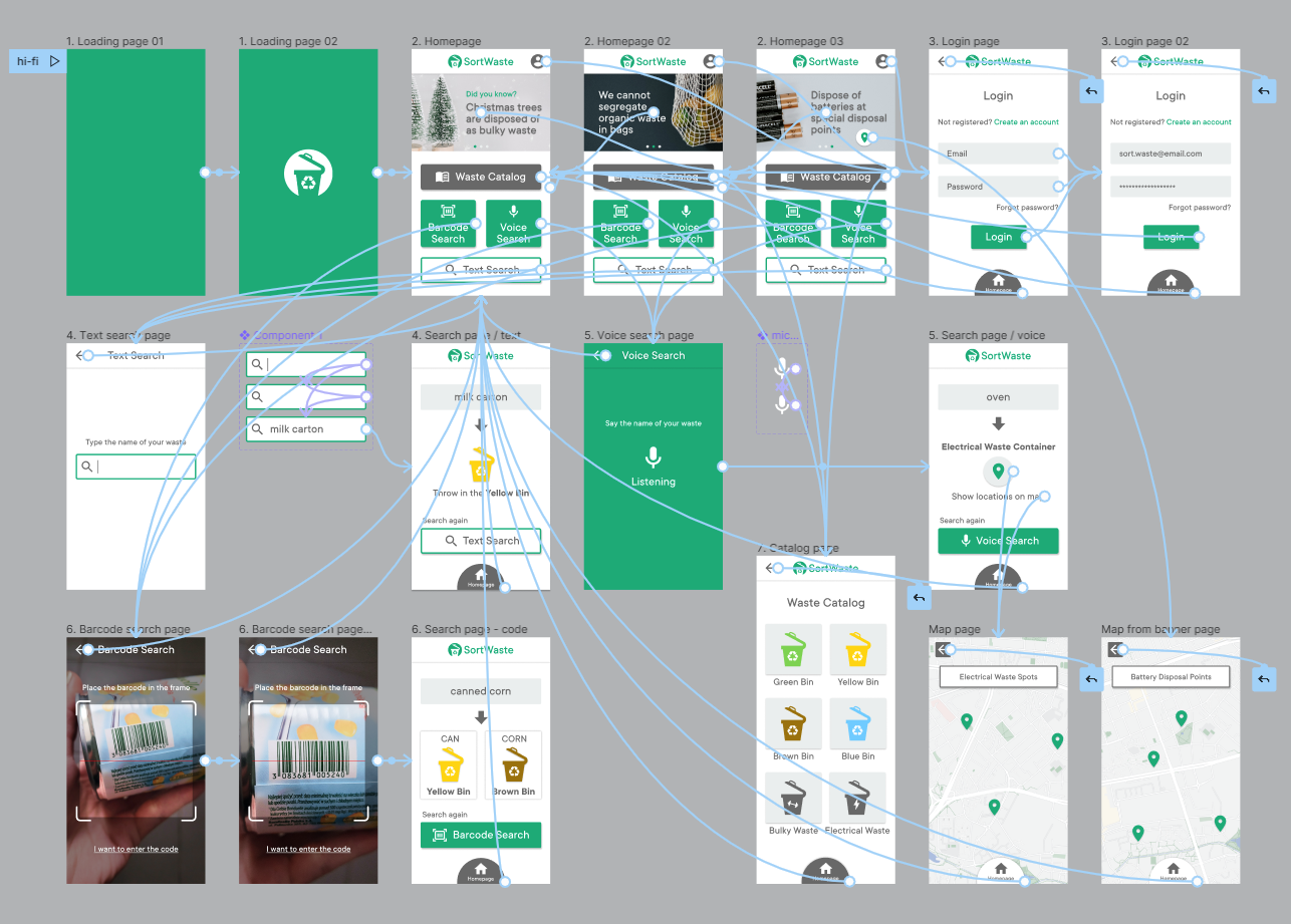
SortWaste mobile app hi-fi prototype flow
STEP 2 - WEBSITE
Once the design of the dedicated mobile app was complete, it was time to design a responsive website for it.
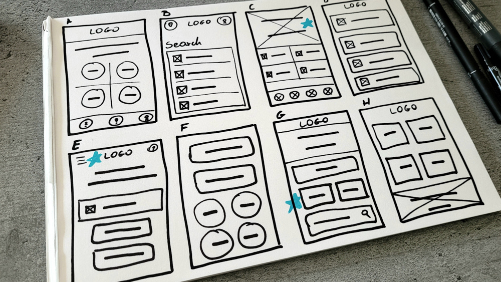
PAPER WIREFRAMES
At the beginning of this process, I drew some ideas of the homepage of the website.
I kept in mind that the web version of the tool should be consistent with the dedicated mobile app. Nevertheless, I also took into account that it should be well suited for use by users on a computer.
I kept in mind that the web version of the tool should be consistent with the dedicated mobile app. Nevertheless, I also took into account that it should be well suited for use by users on a computer.
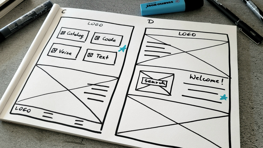
SortWaste website paper wireframes
LOW-FIDELITY PROTOTYPE
Going forward, I transferred my best solutions and created low-fidelity mockups, taking into account all my knowledge regarding this case. In this way, I easily combined particular components with interactions to create a simple prototype of the web version of the tool.

SortWaste website lo-fi prototype flow
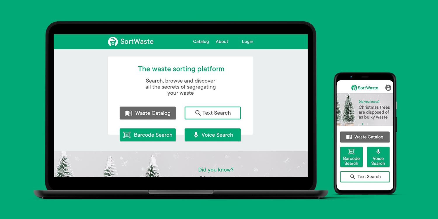
HIGH-FIDELITY PROTOTYPE
I tested the prototype at every moment as soon as I ran into someone. I asked testers to try every method of finding the right rubbish can to dispose of a given waste. This helped me polish my tool to make it as easy and intuitive as possible. I made visual changes to the low-fidelity design, and so a full, cohesive design for the tool's website and dedicated mobile app was created.
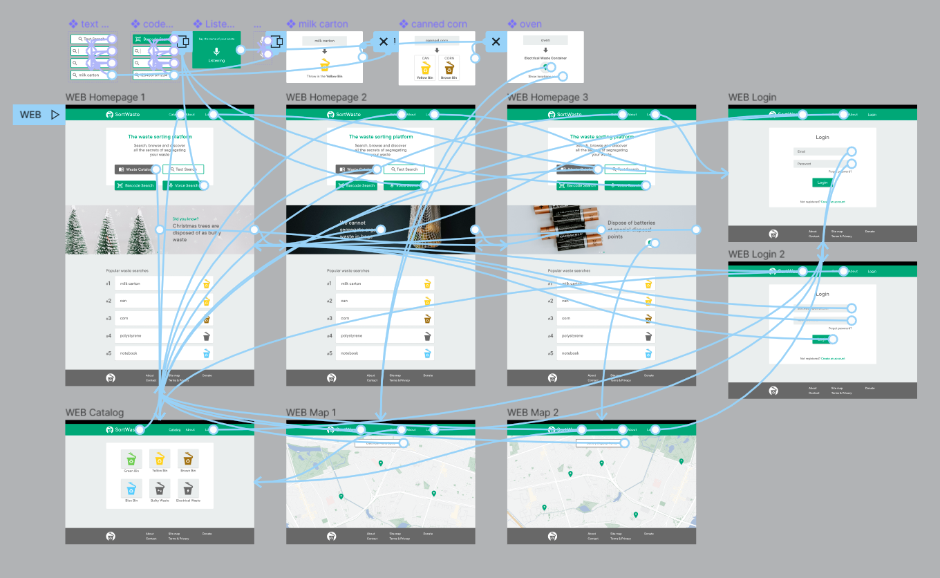
SortWaste website hi-fi prototype flow
TAKEAWAYS
Impact
The tool is described by users as straightforward and intuitive. Many of them said they would like to have such an application on their phone.
Highlighted quotes from user feedback:
Highlighted quotes from user feedback:
“ Looks neat, tidy and easy to read”
What I learned
While designing the SortWaste tool, I've learned that if I properly define the users and their needs, and test the prototype at each design stage, I will get to the point where the tool created will meet everyone's expectations. Creating tools that help people in their daily lives makes me feel very satisfied and gives me a sense of a job well done.
Next steps
- Have a System Usability Scale to see where the tool can be further refined.
- Conduct a real-life Usability Study on the tool to see if it brings real benefits to users and if they are willing to use it.
- Offer the tool to people who could bring it to life.