Snacks for Movie app enables moviegoers to order snacks in the movie theater without standing in queues. In the app users can browse all the snacks available at the cinema. Once an order is placed, the app will inform the customer of the approximate wait time and notify them when it is ready for pickup.
I created this app for my project for the Google UX Design course.
Role:
UX/UI research & design
(individual project)
(individual project)
Duration:
October 2021 - November 2021
My responsibilities:
Conducting interviews,
Paper and digital wireframing,
Low and high-fidelity prototyping,
Conducting usability studies,
Accounting for accessibility,
Iterating on designs
Paper and digital wireframing,
Low and high-fidelity prototyping,
Conducting usability studies,
Accounting for accessibility,
Iterating on designs
Tools:
Figma, Photoshop, pen and paper
THE PROBLEM
Standing in lines before movie starts is the major pain point for moviegoers.
THE GOAL
Design a snack ordering app that allows users to easily browse and order snacks from their phone without standing in line.
RESEARCH
I conducted interviews, created storyboards, empathy maps, personas, user journey maps to understand the users I’m designing for and their needs. A primary user group identified through research was moviegoers who don’t like to stand in lines before movies.
This user group confirmed initial assumptions about cinema customers, but research also revealed that sometimes random situations cause moviegoers to not make it to the cinema on time, so even if they didn't mind standing in line, they would no longer have time to buy snacks.
PERSONAS

PRIMARY
Name: Edmund
Age: 52
Education: Technical school
Hometown: Berlin, Germany
Family: Single, living with parents
Occupation: IT specialist at the hospital
"I don't do anything in a hurry"
Edmund is living with his parents to help them with everyday chores. He enjoys slowly walks with them. He also reads one book a month and meets with people from his book club. They only read books that have their screen adaptation, so they go to the cinema and watch movie version of books. Edmund likes a slow tempo and hates queues, so they agree that one person will order snacks for everyone before the movie starts.
Goals:
- ordering snacks easily
- ordering snacks easily
Frustrations:
- standing in queues
- remembering the snacks choices of the rest of the group
- standing in queues
- remembering the snacks choices of the rest of the group
SECONDARY
Name: Lydia
Age: 33
Education: University
Hometown: Paris, France
Family: Husband and two sons
Occupation: Director's assistant
"Funny stories keep me happy"
Lydia is a very hard-working woman who sometimes works overtime. She always takes her sons to the park after dinner. Her hobby is writing a blog about funny stories she hears daily. When she needs a rest, she spontaneously drops by for a screening to the cinema and enjoy her large bowl of caramel popcorn.
Goals:
- enjoying snacks in the cinema
- enjoying snacks in the cinema
Frustrations:
- not being able to eat popcorn by being late to the movie due to a busy schedule
- holding no money with her often
- not being able to eat popcorn by being late to the movie due to a busy schedule
- holding no money with her often
PAPER WIREFRAMES
Initially thinking about individual screens, I created paper wireframes for the main user path - making an order. These allowed me to immediately see if I had planned the path correctly and made it easier to create digital wireframes in Figma later. I was wondering how the homepage should look like, so I iterated some ideas for it. Then I placed stars next to the part of designs I liked best and created a whole homepage with them.
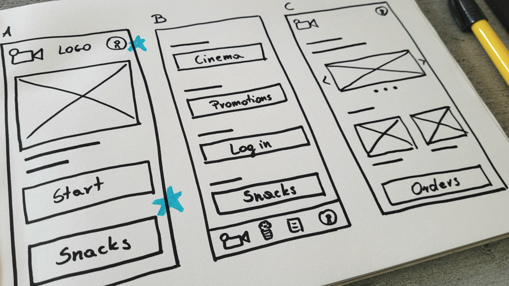
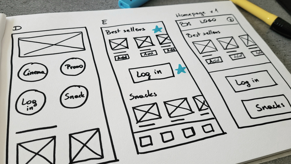
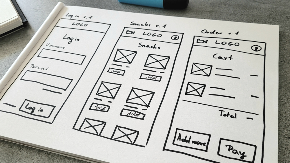
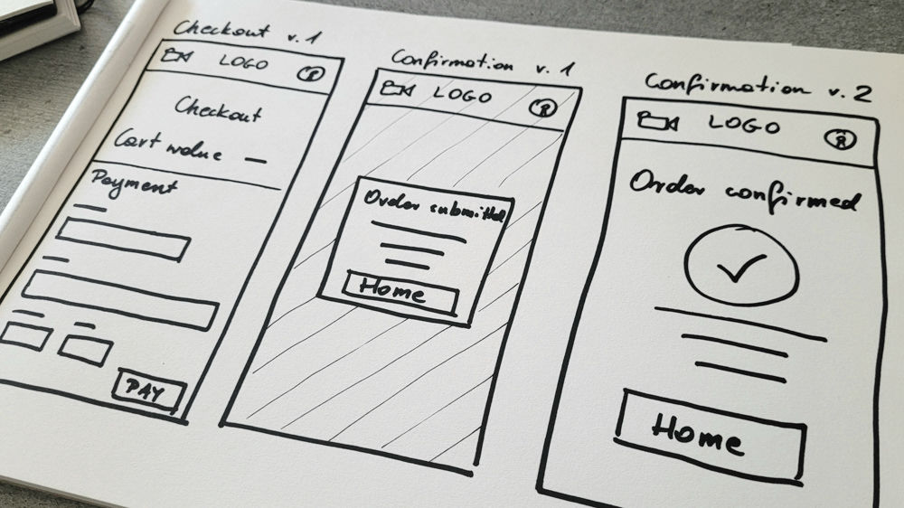
Snacks for Movie app paper wireframes
LOW-FIDELITY PROTOTYPE
With functionality in mind and a focus on the end user, I created simple wireframes of individual screens that I linked together with interactions. This gave me a low-fi prototype, so I could test whether the app fulfils its purpose and identify potential errors.

Snacks for Movie app lo-fi prototype flow
USABILITY STUDY
I conducted tests with five people by asking them to perform some simple tasks. How instructive it was to watch them when they used the prototype! Everyone was using the app in a slightly different way to perform the same tasks I asked them to do.
Then, I took out all the insights and created an affinity diagram. This allowed me to understand the results of the test even better, as well as their importance.
Findings from the study helped me guide the designs from wireframes to mockups. I found places where I could improve the prototype to make it even easier for users. All testers said that the application is easy and intuitive, but I caught the details that I added and refined to make it even more convenient.
Findings:
1. Users need to be able to add snacks to cart by clicking on their photo.
2. Users require more info about their current order.
3. Users need to have categories/search engine on the snacks page.
4. Users require more convenient information after logging in and adding snacks to the cart.
1. Users need to be able to add snacks to cart by clicking on their photo.
2. Users require more info about their current order.
3. Users need to have categories/search engine on the snacks page.
4. Users require more convenient information after logging in and adding snacks to the cart.
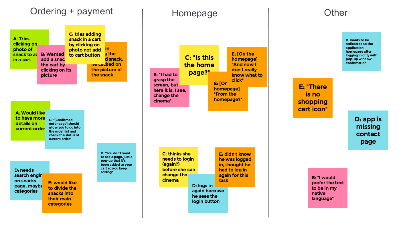
Snacks for Movie app affinity diagram
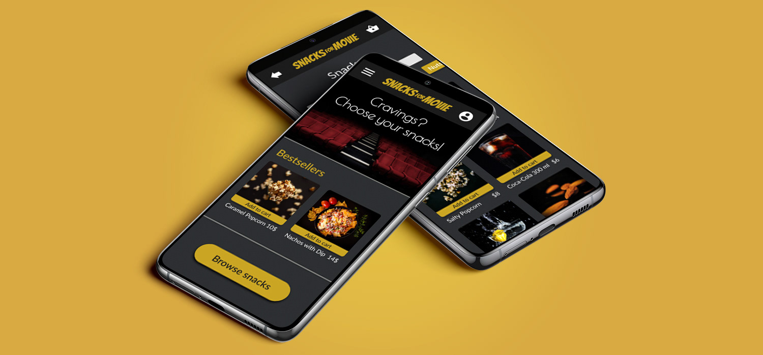
HIGH-FIDELITY PROTOTYPE
The final high-fidelity prototype presented cleaner user flows for ordering snacks and checkout. It also met user needs for a login in as well as easier way to add snacks to cart.

Snacks for Movie app hi-fi prototype flow
TAKEAWAYS
Impact
The app is described by users as easy to navigate within.
One quote from user feedback:
One quote from user feedback:
“ It's good that there are so few things on the screens, because it makes it easier to read”
What I learned
While designing the Snacks for Movie app, I learned that my early design choices were just the foundation of the process. After iterating the designs and getting user feedback, I was able to refine those designs to meet the needs of the users.
Next steps
- Conduct the Usability Study again on a different group of participants with the same profiles to see if the changes brought real value to users.
- Have a System Usability Scale after usability study to see overall evaluation of the application.
- Conduct a Competitive Audit on our biggest competitors to see what their app design strengths and weaknesses are to learn how to better design our app to be even more visually pleasing to users.